
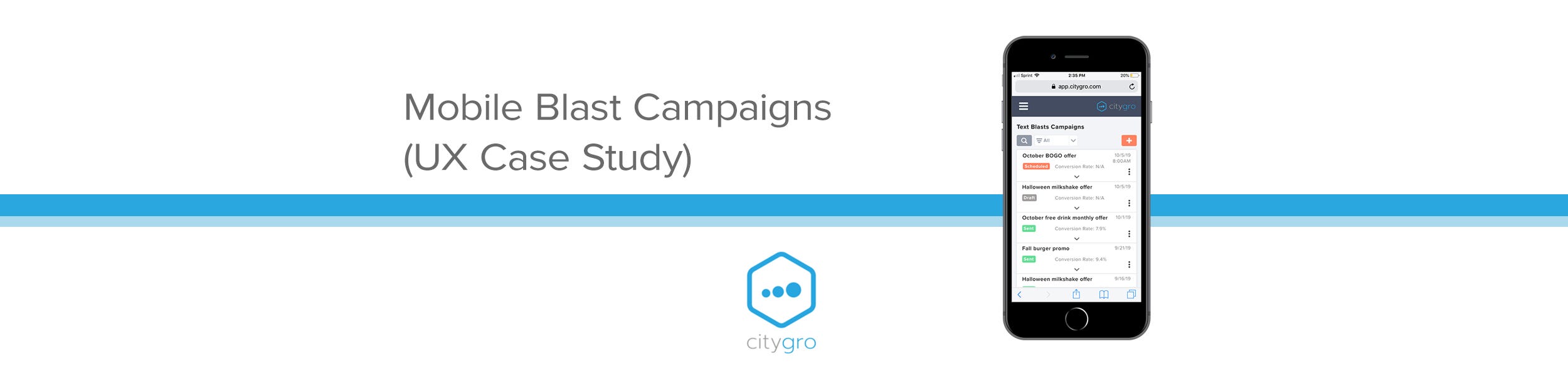
Project Overview
CityGro (now known as Patch) is a small business focused on customer retention software. Their CRM platform lets businesses manage accounts, customize kiosk flows and waivers, run SMS conversations, and send targeted SMS and email blasts triggered by customer behavior.
This case study highlights my work optimizing the blast setup experience in CityGro’s mobile app. While the app used responsive design, key desktop features didn’t translate well to smaller screens, at times requiring users to rotate their phones just to access critical buttons.
As the sole designer on the project, I collaborated closely with a Product Manager, Customer Success, and Development to identify pain points, prioritize improvements, and deliver solutions that aligned with the design system.
Project Goals
The goal was to eliminate friction in the mobile blast campaign flow, making it simple, intuitive, and visually polished. The desire was for users to confidently create and send campaigns from their mobile device, without frustration.
We also aimed to streamline the experience enough that CityGro’s Customer Success team could recommend the mobile app with confidence, knowing it would reduce confusion and minimize user error.
Research
To kick off the analysis, I explored the mobile experience firsthand, creating blast messages, identifying friction points, and noting usability gaps. A few issues stood out immediately, but I also sought feedback from the CityGro team to validate my findings and uncover anything I might have missed.
I interviewed the Customer Success team, who support customers daily with blast campaigns, to gather insights. I also discussed pain points and priorities with the Product team during UX strategy meetings, helping shape the direction for ideation and wireframes.
Key Opportunities for Improvement:
Jarring input behavior: Opening text fields or dropdowns caused zooming, screen bouncing, and dislodged navigation button, sometimes pushing the “Next” button below the fold.
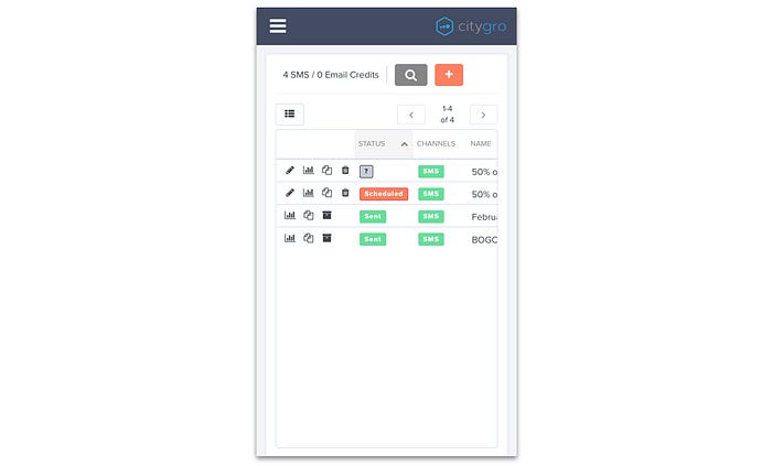
Unusable table layout: The main campaign list was hard to navigate on mobile, descriptions were cut off, and the control buttons (edit, analytics, duplicate, delete) took up excessive space.
Clunky email editor: The editor required too much scrolling, and the preview didn’t adapt to mobile dimensions, making edits to communication difficult.
Unnecessary fields: Advanced internal-use fields were prominently displayed, confusing users and cluttering the interface.
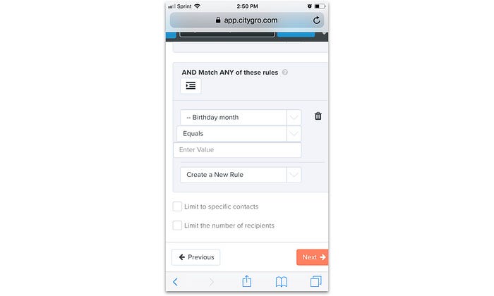
Poor alignment: Layout inconsistencies, especially in the recipient rules/filters tab, hurt readability and trust.
No progress tracking: The setup flow lacked a progress bar, forcing users to tap “back” repeatedly to revisit previous steps.
Wireframing
I kicked off ideation with hand-sketched wireframes, then refined them in Sketch. I ensured alignment with existing design system to avoid unnecessary dev work. I ran the refinements by users and gathered more feedback, leading to multiple iterations.
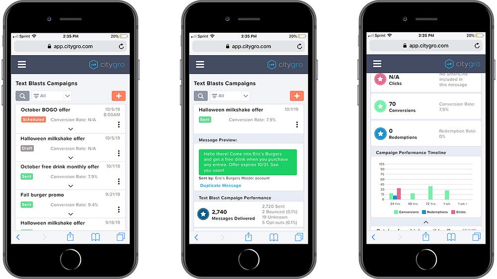
These screens show the redesigned Blasts section, featuring stacked expandable cards for a cleaner, more mobile-friendly campaign overview. Expanding a card reveals a message preview, key performance stats, and a campaign timeline. A dropdown filter lets users quickly toggle between “Sent,” “Scheduled,” and “Draft” blasts.
I focused on surfacing the most important info in the collapsed view. Based on input from Customer Success, each card highlights:
- Campaign description
- Color-coded delivery status
- Conversion rate (based on kiosk check-ins)
- Delivery date
- A kebab menu with Edit, Duplicate, and Delete options

The above updated blast communication type screen eliminates stacked cards and scrolling, making options easier to scan and select.
In the recipient filter view, I replaced inconsistent, right-aligned dropdowns with uniform, left-aligned fields for a cleaner, more intuitive layout.
The email editor now fits the screen—resizing the tools panel and preview to remove horizontal scrolling. We also added a note recommending desktop for the best editing experience, with future mobile improvements planned.
Lastly, a new progress bar was added to the top of each screen, doubling as a clickable nav to streamline the setup flow.
Results
After the release of these updates, I followed up with Customer Success and confirmed that they were receiving far less complaints in regards to the mobile experience for creating blast campaigns. There was also an uptick in completions of blast campaign setup via mobile devices, with a 20% increase.
