
Project Overview
I was a UX Designer at Rent Dynamics for three years, focusing primarily on RentPlus, a product that helps renters build credit by reporting on-time rent and utility payments to credit bureaus. Here’s how it works:
- Residents at participating properties pay rent (and sometimes utilities) on time
- RentPlus team reports those payments to the credit bureaus
- Payments show up on residents’ credit reports, helping build or improve their scores
It’s been incredibly rewarding to design for a product that helps people take steps toward reaching major financial goals, like buying a home or qualifying for a loan for larger purchases.
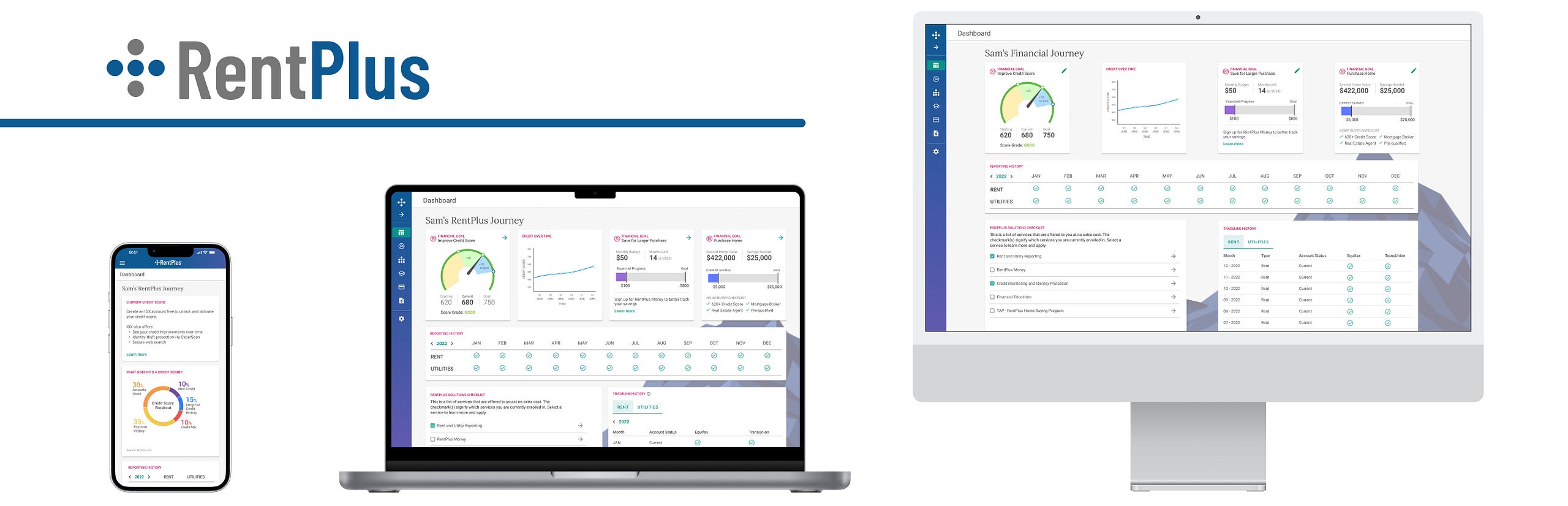
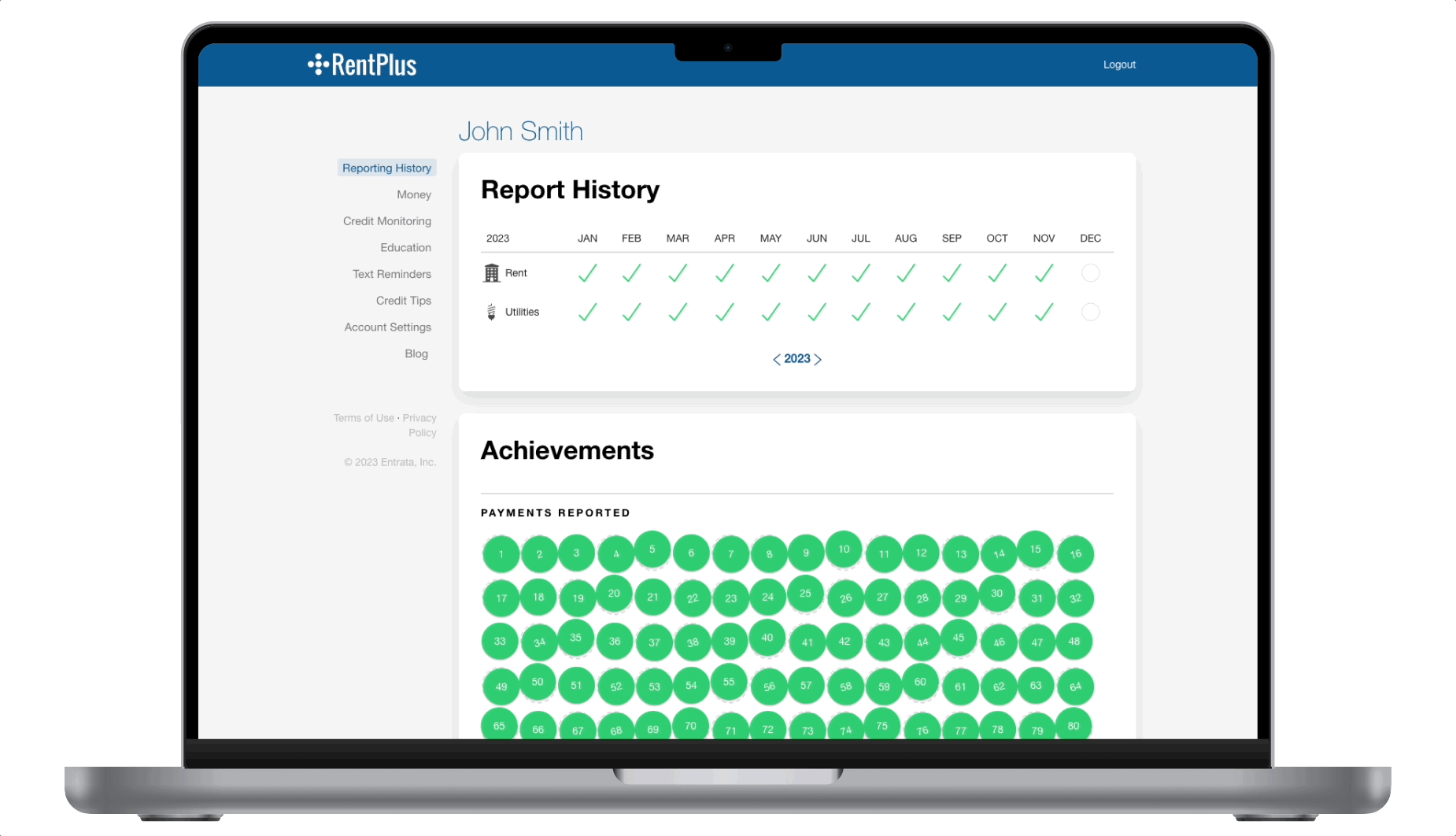
RentPlus also offers a web portal where users can confirm their payments are being reported, track credit progress, and access financial education and monitoring tools.
However, the original portal, which launched over 8 years ago, saw little engagement and had minimal updates in that period of time. In 2023, I was tasked with a full redesign to modernize the experience, add valuable features, and give users a reason to return, even after moving out of a participating property or canceling their RentPlus account.
MY ROLE
Led UX Design and Research
COLLABORATORS
UX Director, Product Management, Engineering
DESIGN TIMELINE
2 months
Design Problem
RentPlus users need to build and track credit progress to qualify for major purchases or loans.
With outdated UI and low engagement, the portal was ready for a revamp, and I was eager to lead it. I’d already been advocating for a modernized UI and streamlined workflows across RentPlus, but the resident-facing portal became a clear top priority.
Research
Before kicking off ideation, I worked with the RentPlus product team to interview users about the current portal experience and what features they wanted most.
Insights confirmed our assumptions: most users logged in only 1–2 times a year, mainly to confirm rent was being reported. One college student admitted they didn’t understand credit-building and figured they’d “Google it” when needed. Another user said the outdated UI made them hesitant to trust the data or share personal info.
Lack of feedback was also a concern – errors had no clear resolution path, leading to frustrating dead ends.
The most requested feature? A quick view of their current credit score—something the portal didn’t yet offer.
Ideation
Guided by user feedback and company vision, we set out to make RentPlus more than just rent reporting application. Since residents often move out of participating properties, we designed a solution that stays with them, offering financial education and tools to help them keep building credit and reaching financial goals wherever they go, making the product more sticky.
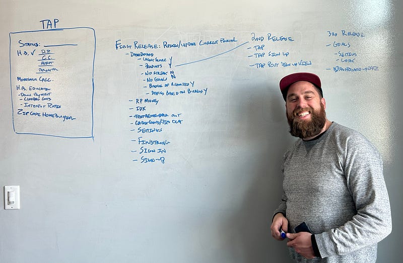
I kicked off ideation with product owners – diving into research, whiteboarding, and FigJam-ing to shape user stories and define a phased rollout. We landed on a three-phase release for the portal redesign:
- Phase 1: MVP reskin of the current portal with improved sign-up flow and updated dashboard
- Phase 2: Add credit score to dashboard and launch new TAP (The Advantage Program) home buying tab
- Phase 3: Introduce goal-setting and progress tracking features
While whiteboarding, we reworked the information architecture and streamlined the portal’s content, removing outdated features, like rent reminders and consolidating add-ons that had been shoehorned into the portal over time.
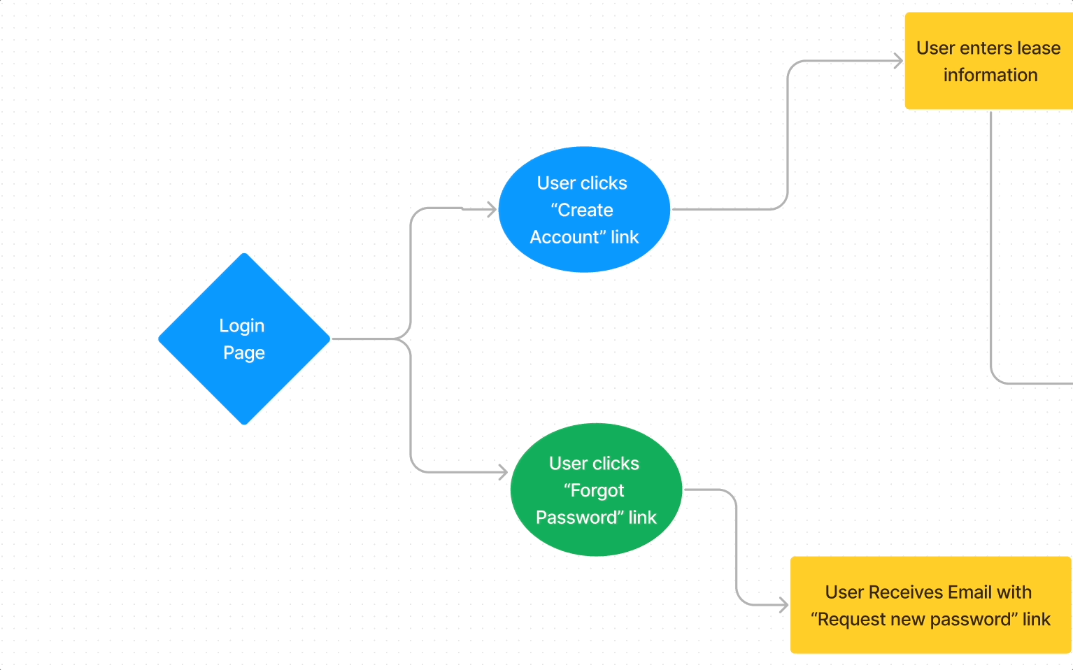
With the release plan set, we began fleshing out key workflows, especially self-signup. The existing flow was clunky, with inconsistent UI and dead-end error states. To fix that, we mapped out a cleaner experience with guided error handling and clear user paths.
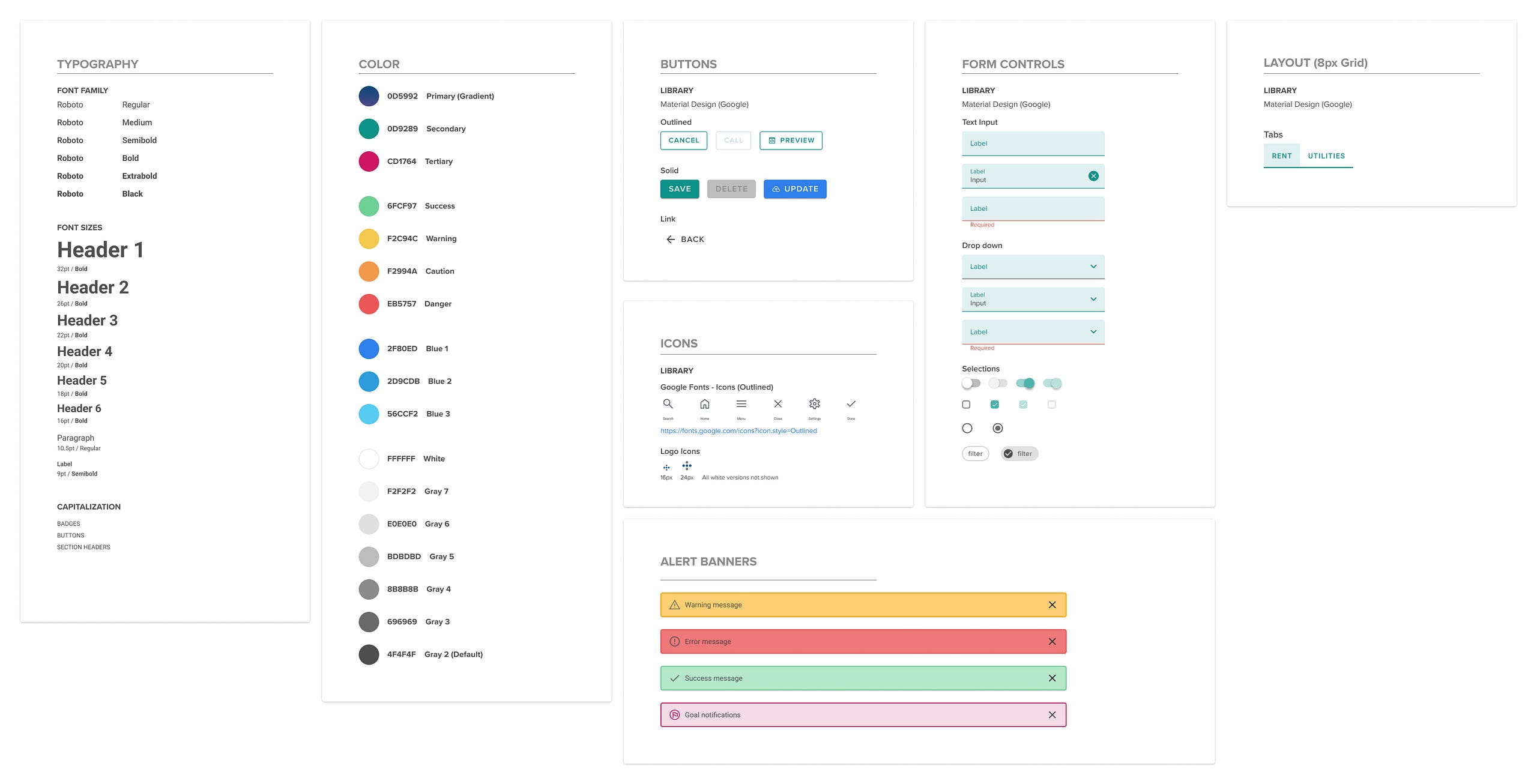
Creating Style Guide
At Rent Dynamics, we’ve been rolling out a new design language using Google’s Material components across our CRM. Given our engineering team’s familiarity with Angular Material and to keep consistency across products, I chose to use Material with customized colors.
For RentPlus, I kept the brand’s signature blue, but introduced new complementary colors for broader appeal and better contrast. We replaced the old yellow-orange, which often failed accessibility standards on white backgrounds.
Here is the style guide employed for this redesign:
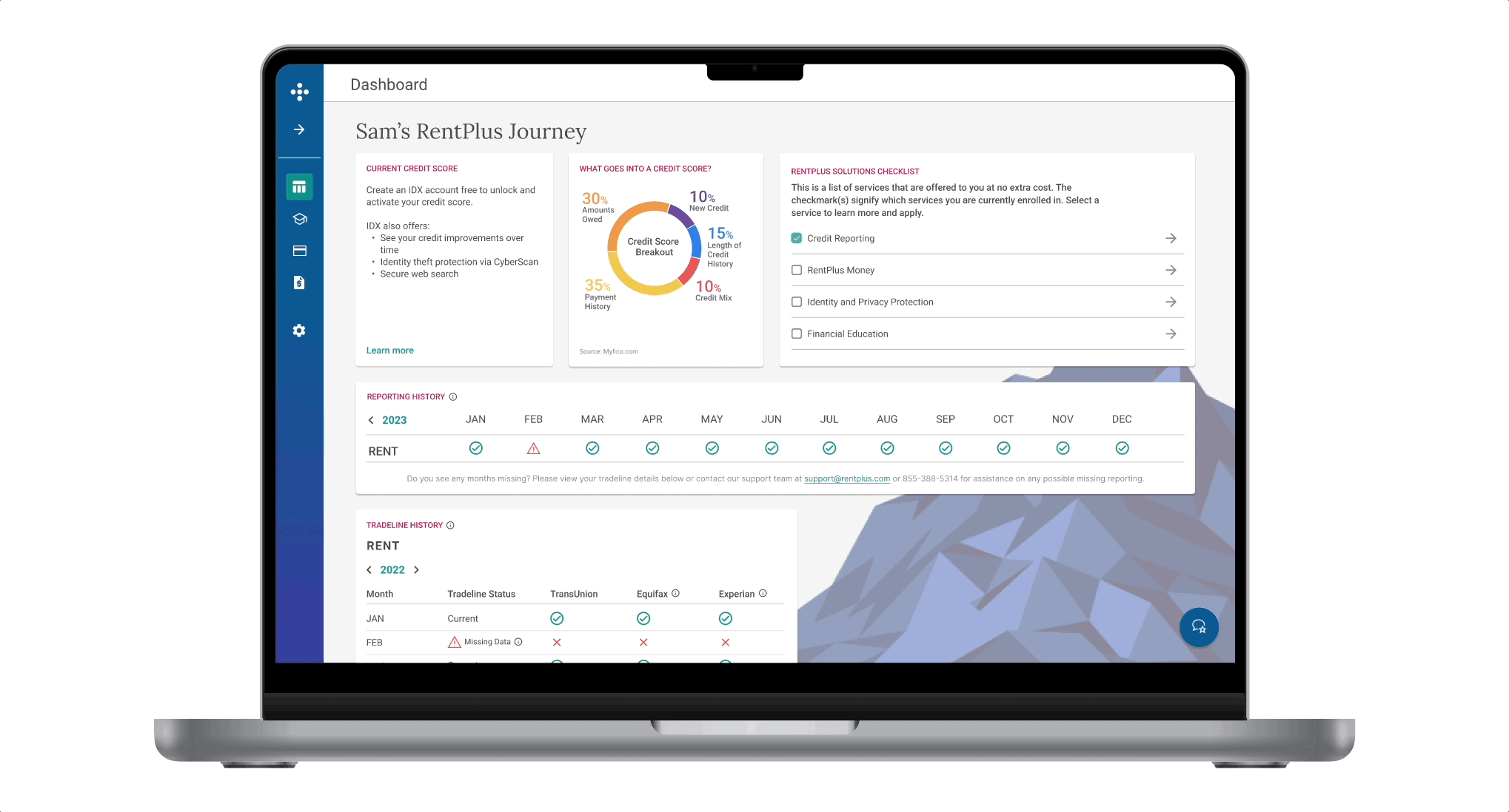
For the MVP, we focused on enhancing the resident dashboard by highlighting the free programs included with a RentPlus subscription. We introduced a visual checklist for quick access and easy sign-ups.
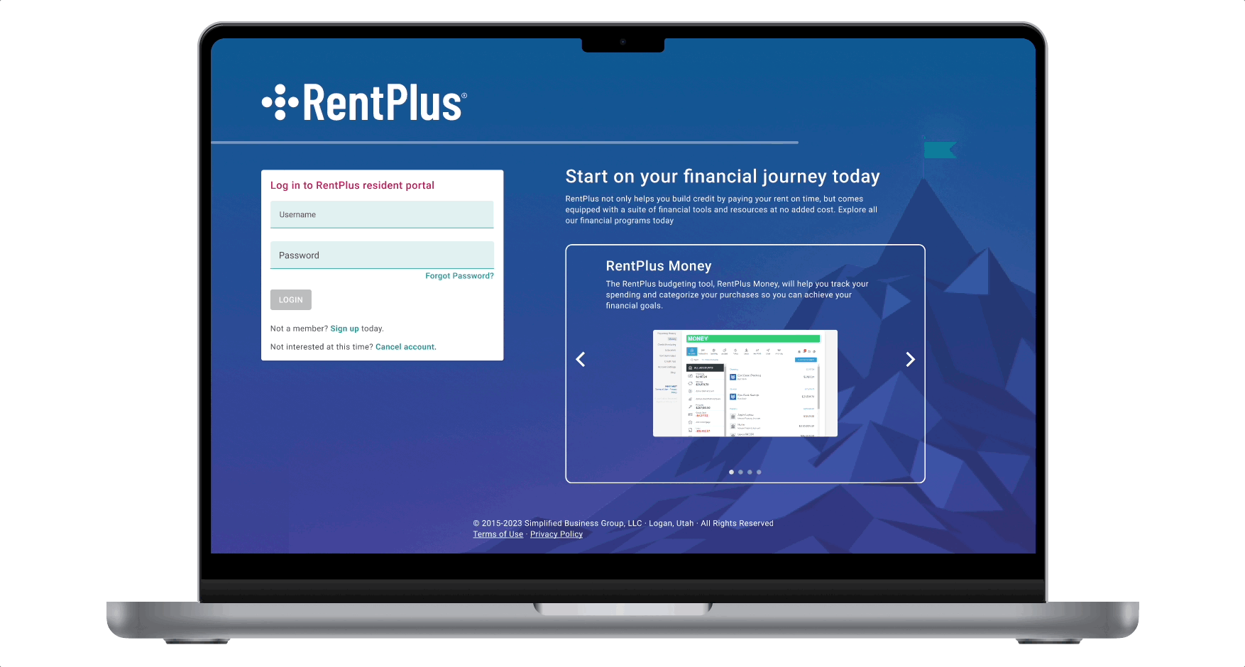
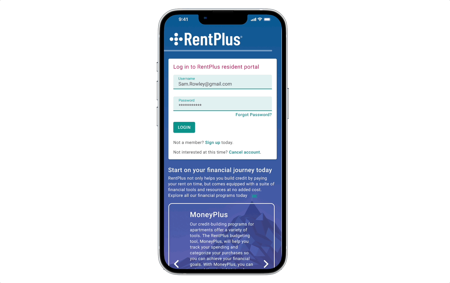
To reinforce the idea of financial progress, we used mountain imagery. This aligned with our RentPlus marketing and debit card visuals, which symbolize the resident’s journey toward their financial summit. The original portal was visually bare, so the imagery added both appeal and balance to the desktop layout.
We also updated the tone of dialogs and error messages. The old version felt too casual, even including outdated emoticons. Given that residents share sensitive personal information for rent reporting, we aimed for a more professional, trustworthy voice and one that reassures users, especially those unsure about credit.
Responsiveness
Google Analytics showed most residents accessed the portal via mobile, followed by laptops. Since the current portal wasn’t fully responsive, I took a mobile-first approach to ensure an optimized experience on smaller screens as I began designing.
Side Navigation
We kept the side navigation but made it collapsible to maximize screen space, defaulting to an icon-only view with tooltips on hover. To reduce accidental motion, expansion now requires a deliberate click on the arrow icon rather than triggering on hover.
Release #1 Prototype
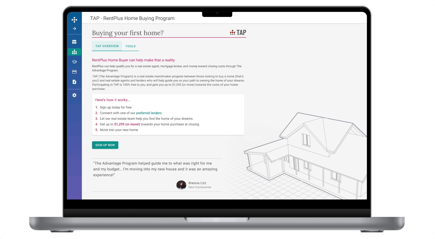
Release #2: Home Buying Status Page
The Advantage Program (TAP) introduces a clearer path to homeownership for residents. TAP connects users with a preferred lender, real estate team, and offers up to $1,300 toward closing costs and there’s no cost to join.
Buying a home is overwhelming, so we focused on simplifying the process with a progress-tracking wizard and a “Tools” tab that includes a mortgage calculator, home buying checklist, and helpful resources.
A dashboard widget shows users where they are in their journey, and dynamically pulls in contact info for their lender and agent via Salesforce. On the Home Buying page, a subtle architectural background adds polish without distracting from content.
Release #3: Goal Setting
To reinforce the financial climb up the mountain theme, we wanted users to plant their own flag at the summit by setting personal financial goals.
We explored multiple iterations of the goal-setting experience, aiming for a tone that felt conversational and aligned with the tools and programs available in the portal.
As we shaped the flow, I asked key questions to guide design decisions around timing, content, and placement:
- When do we want to prompt our users to create these goals?
- Do we allow them to create their own custom goals?
- What are financial goals that people have?
- What products are they already using to achieve these goals?
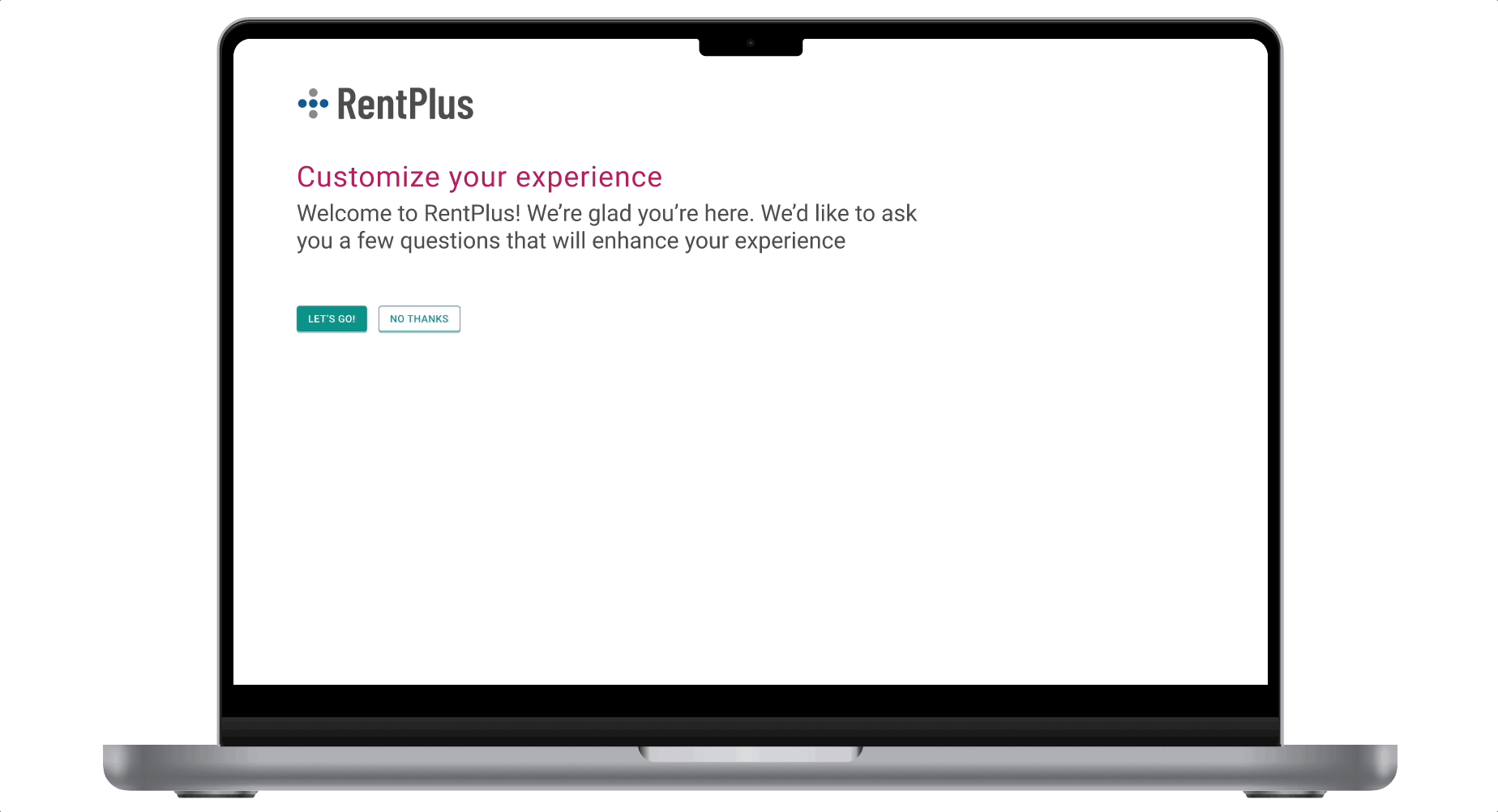
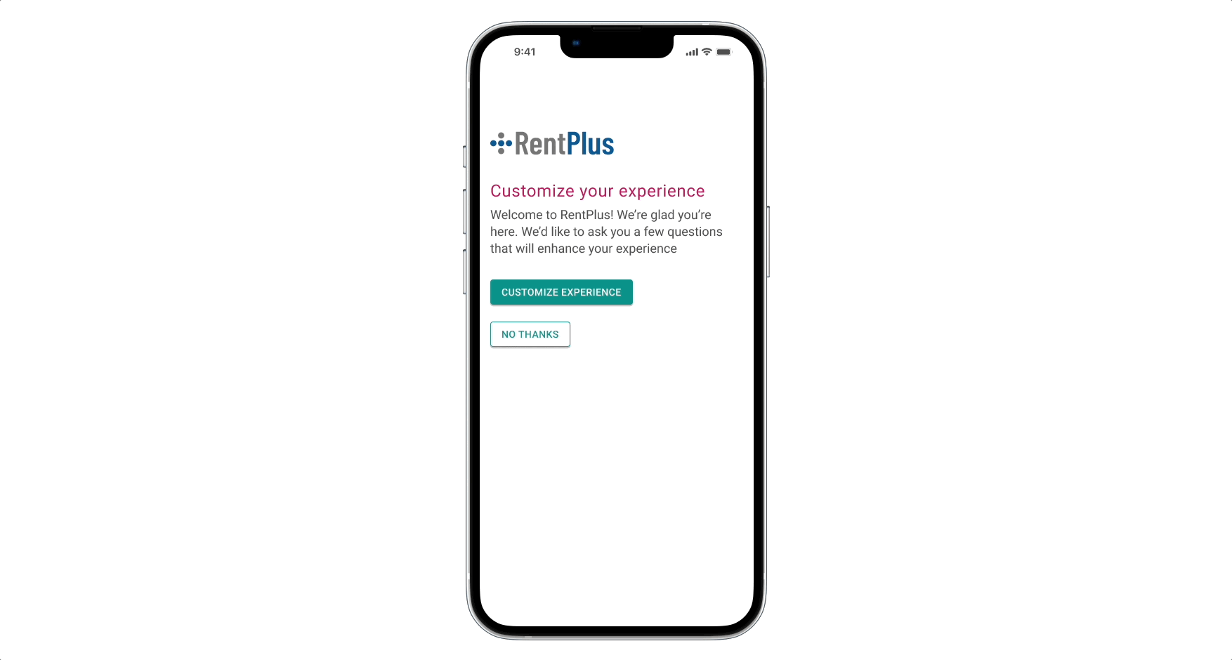
In collaboration with my product manager, we defined acceptance criteria for the goal-setting feature and decided to prompt new users with a quick goals survey on first login. Initial user testing revealed the language felt dry and the process uninspiring, so we streamlined the questions, making them more direct while maintaining a friendly, conversational tone.
Recognizing that new users might not be ready to complete the goals survey on first login, I ensured they could exit at any point and explore the portal. To re-engage them, an alert banner on the dashboard provided a quick link back into the goal-setting wizard, which was also accessible via the left navigation.
Each goal is tied to a free RentPlus program, with a dedicated page for users to edit goals and receive tips to stay on track. Once set, goals appear as widgets on the dashboard, offering an at-a-glance view of progress.
Conclusion and Learnings
It’s always exciting to have the opportunity to create a style guide for a product redesign. In that excitement, I found that I overlooked gathering input on a few things from the dev team early in the process. This could have helped cut down on some of the back and forth as they began coding the portal redesign. I haven’t always taken full advantage of Figma’s component features, but I made a conscious effort to do so throughout this project. By doing so, I was able to efficiently iterate and update workflows after receiving feedback.
There were times during this project where I wish I would have failed faster by getting designs in front of users and the executive team sooner in order to begin the next iteration. I love usability testing and the insights gained through that process. It only makes the overall product experience better and gives me the confidence that the solutions will be intuitive enough for the endusers.
