
Introduction
Rent Dynamics is a company that makes products for multifamily housing property management companies. Rent Dynamics’ call center has long been a lifeline for many of these companies, handling overflow calls. The audio from these countless calls is stored in Rent Dynamics’ database. To make this vast audio archive more actionable, I (along with fellow designer, Max Williams) was tasked with creating a feature for the CRM product (web application) to view text transcriptions and integrate these calls into our web application.
Calls and emails are goldmines of valuable information. By extracting and presenting key insights in an easily digestible format, our product empowers clients to make data-driven decisions. This will enable them to refine employee training, optimize marketing strategies, and maximize revenue.
MY ROLE
Led UX Design and Research
COLLABORATORS
UX Director, Product Management, Engineering
TIMELINE
2 weeks
Design Problem Statement
Property Management Companies (marketing managers and leasing office managers) need a way to quickly search email and phone communication because they want to be able to provide better service to residents and leads and increase revenue.
Design Constraints
I was given two design sprints (4 weeks total) for this project and final deliverable of high fidelity wireframes and prototypes of the MVP for this feature.
Research
I spent a day looking at existing products that offer a similar service and made a list of what each of them did well and how they could be improved upon. As I pulled together the lists, we didn’t see many that allowed us.
We also introduced the idea of this feature to some of our larger client users to get an idea of what they would wish and hope for from a tool like this. Our team had also found that including our clients in initial discussions made them feel more involved and led them to adopt and utilize the new feature. We also made sure to circle back with these clients once we had prototype to share to collect more insights.
Ideation
To ensure optimal user experience across various devices, we designed the feature to be fully responsive on desktop, laptop, and tablet screens. Given the extensive content and components, a mobile-first approach wasn’t feasible. Our focus was on delivering a seamless experience on larger screens. Based on the product requirements document (PRD), we prioritized the following key elements:
- Viewable Transcriptions: Access transcriptions for both calls and emails.
- Smart Search: Easily find specific communications with advanced search and filter options.
- Insights Dashboard: make better decisions based on insights that group conversations based on keywords and phrases.
User Stories
Working with our product managers, we wrote the following user stories:

- As a Rent Dynamics superuser (admin), I want to be able to easily make default widgets that best represent what our clients are looking for in the reporting side of the CRM.
- As an executive, I would like to easily see an overview of how customer service representatives in my communities are performing compared to my other communities and compared to the rest of the multi-family housing industry.
- As a regional manager, I want to be able to make customized insights that can best inform me about some of the shortcomings and strengths of my communities to better assess quality of life and employee performance.
- As a marketing manager, I would like to see what topics are being brought up the most in conversations in order to tailor our advertising campaigns to highlight the value and popular amenities of the community.
- As a community manager, I would like to see an overview of call insights that are presented to me in an accessible format that is simple to digest. This will allow me to evaluate employee performance and find common issues that residents and leads are discussing.
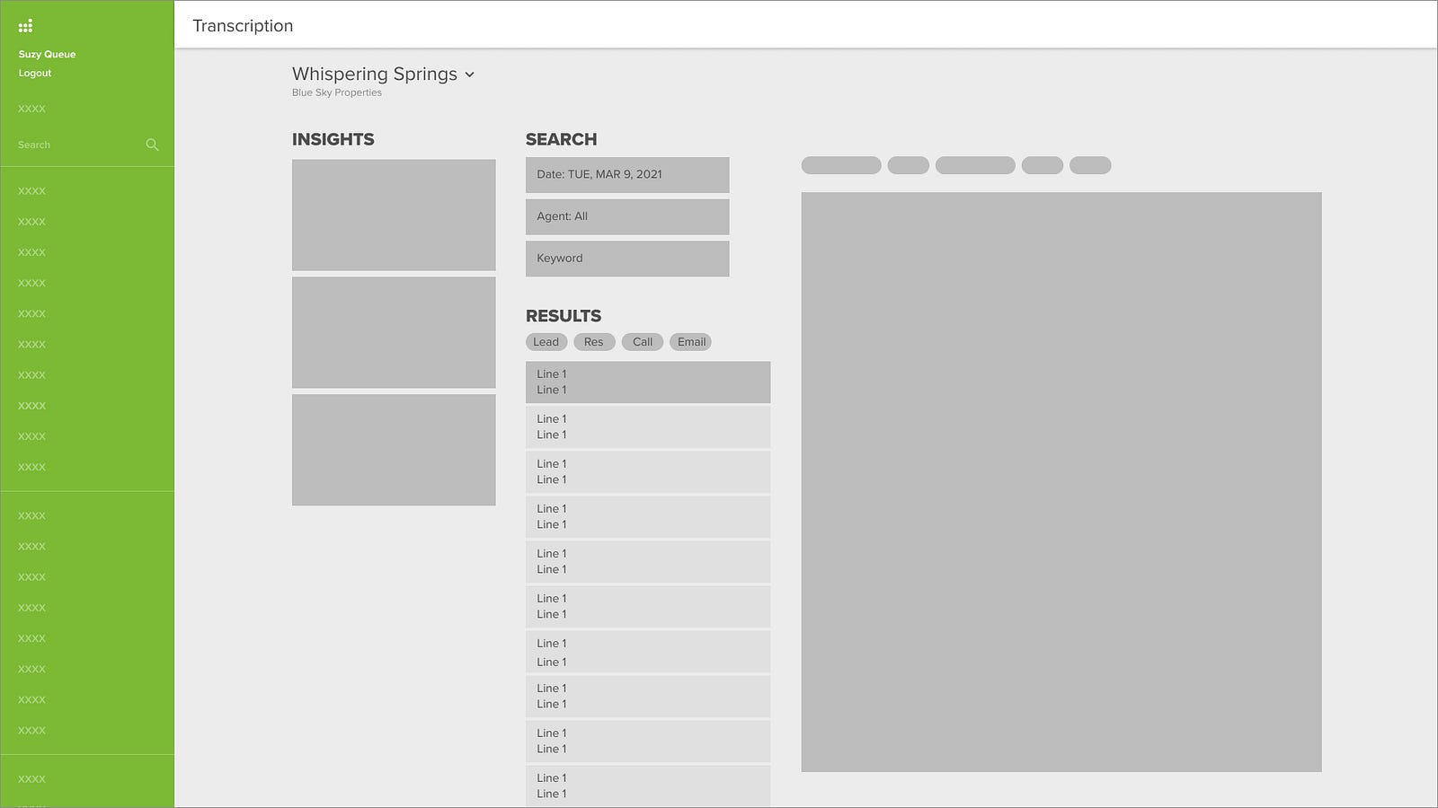
Low Fidelity Wireframes
Below are early hand sketches before designing low-fidelity wireframes in Figma. I had multiple iterations and as I introduced higher fidelity components, it was easy to see with the amount of text, that items would need to be re-arranged to cutdown on the visual clutter.


High Fidelity Wireframes and Prototypes
Initially, I placed the insight panel vertically on the left side of the screen. However, this design proved to be visually overwhelming and limited the width of the crucial transcription display. It became evident that a more focused approach was needed.
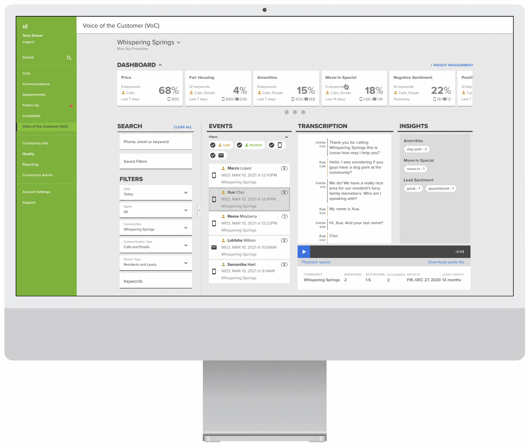
After user testing, I opted to vertically stack the filters and horizontally align the dashboard at the top of the screen. This layout allowed for the collapse of both components into drawers, maximizing space for the list of communication events and their detailed views.
Viewing Events
The below prototype is the default view that a user sees. The list of communications are the most recent at that community. It includes both Resident and Lead communications. When a
Because there is a lot of information to display on one screen, I gave users the ability to collapse the group of filters, as well as the dashboard with the various insights to give a more focused view of the communication and read or listen to what their customers are saying.

Insight Management
In order to demonstrate the power of this tool, once released, our client users would have a number of default insights. These included:
- Price
- Fair Housing
- Move-in Special
- Negative Sentiment
- Positive Sentiment
By clicking on the Insight Management link, users navigate to a page where they are able to view, edit, or delete existing insights (keywords, speaker type, person type, date range for widget, and the list of communities call and email communications are being pulled from). Users are also able to create new insights. I also wanted to include a preview image of the widget to allow the user to learn what each data point means as they filled out the input fields during the creation process.
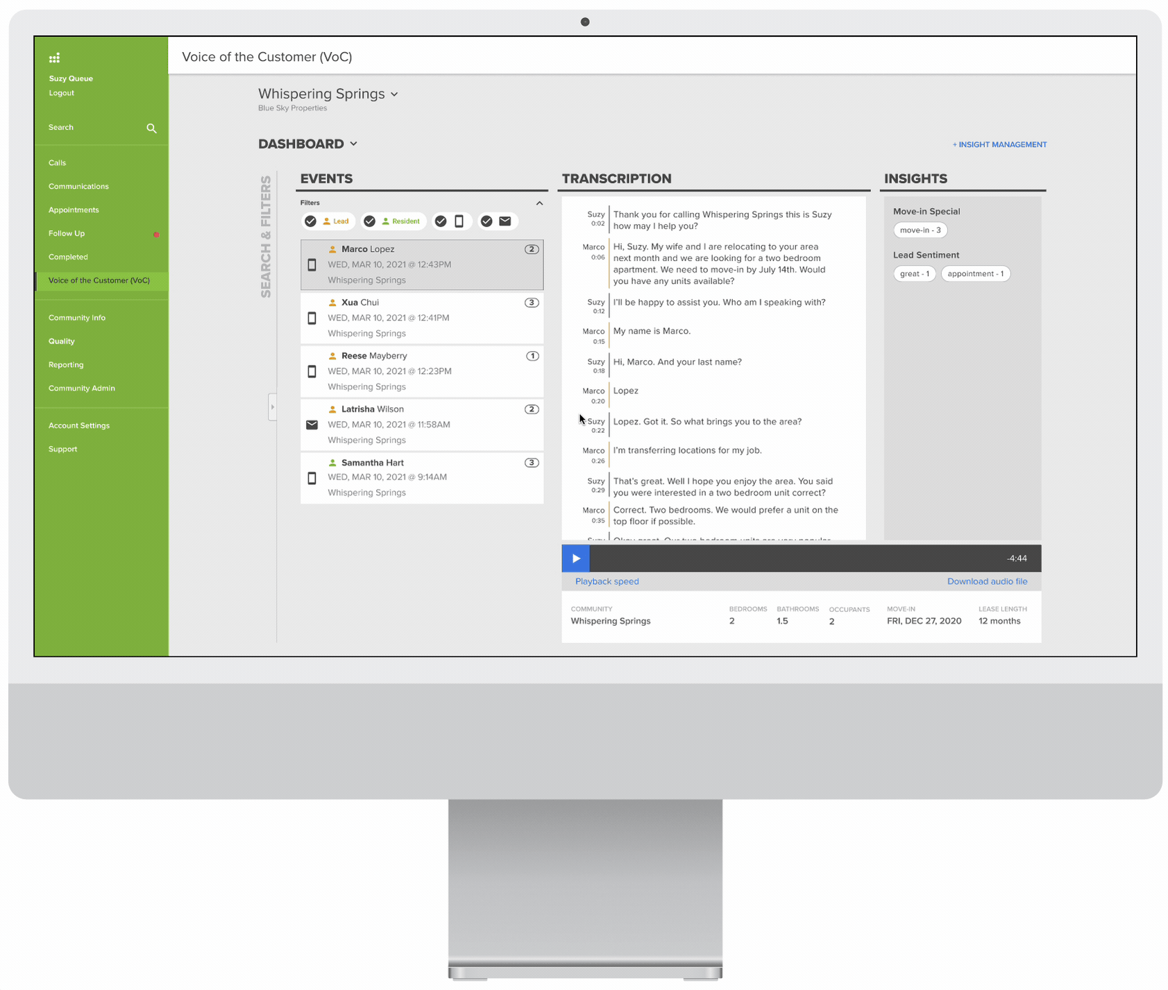
Navigating Transcriptions
I wanted a quick way to skip to excerpts of the transcription where a lead, resident or leasing agent said a specific keyword that is included in the created insight.
By employing pill components that included each keyword and the number of times it was mentioned during the conversation, with each click of a pill, the user is taken to an instance in chronological order. In the case of a phone call, the audio recording automatically jumps to that point in the conversation.
Usability Testing and Feedback
We met with marketing managers and a few other roles from three different clients where we walked through multiple workflows. During these feedback sessions, we were able to gain insights and develop new user stories, specifically from a leasing center manager who wanted to use the tool as a sanity check of their leasing agents’ performance on calls.
I did usability testing with 3 different users locally. Being able to validate which designs were the most efficient was crucial as I iterated on the design.
Results and Next Steps
The Voice of Customer feature has been turned on for 8 different clients and has received great feedback on customer satisfaction surveys. This has led to plans to design and build a corresponding, more robust dashboard feature.
