
RentPlus is a product utilized by hundreds of property management companies in the multifamily housing industry. At participating properties, Rent Dynamics/Entrata will report on-time rent and/or utility payments to credit bureaus in order to help enrolled residents build credit. Overall, it is a turnkey solution at a minimal monthly fee that they are able to offer to their residents.
In 2021, Rent Dynamics released a new feature that streamlined the process of pushing RentPlus charges directly to clients’ property management systems and onto their residents’ ledgers. Within the RentPlus Admin application, Account Managers can QA and approve generated charges for their clients. They can view overall client-level statistics, drill down to community-level details, and examine individual resident charges, approving or rejecting those with errors or discrepancies.
MY ROLE
Led UX Design and Research
COLLABORATORS
Product Management, CSM Team, Engineering
DESIGN TIMELINE
1 week
Design Challenge
Account Managers need a way to quickly and confidently review charges being pushed to a growing number of clients’ ledgers, so we will deliver enhancements to the existing QA process that takes into account scale to achieve accurate charges and insure payments are being collected from enrolled residents.
Research
To address this challenge, I conducted in-depth interviews with four Account Managers responsible for QA-ing monthly charges. These discussions provided valuable insights and feedback:
Key findings from interviews:
- Accuracy Concerns: account manager users expressed distrust in the accuracy of client-level statistics.
- Performance Issues: Load times were slow, especially for a growing number of clients.
- Community-Specific Charge Splits: Account Managers needed to view charge splits for each community.
- Filtering and Prioritization: Filtering capabilities were essential for efficient charge review.
- Alphabetical Sorting: Clients and communities were not consistently sorted alphabetically.
- Error Visibility: A clear method for viewing successful and failed charge pushes was necessary.
Ideation
Based on the research findings, I collaborated with a Product Owner to develop a set of filters and iterated on the existing design and workflow. Through rapid prototyping and usability testing, we refined the solution.
The “Before” Workflow
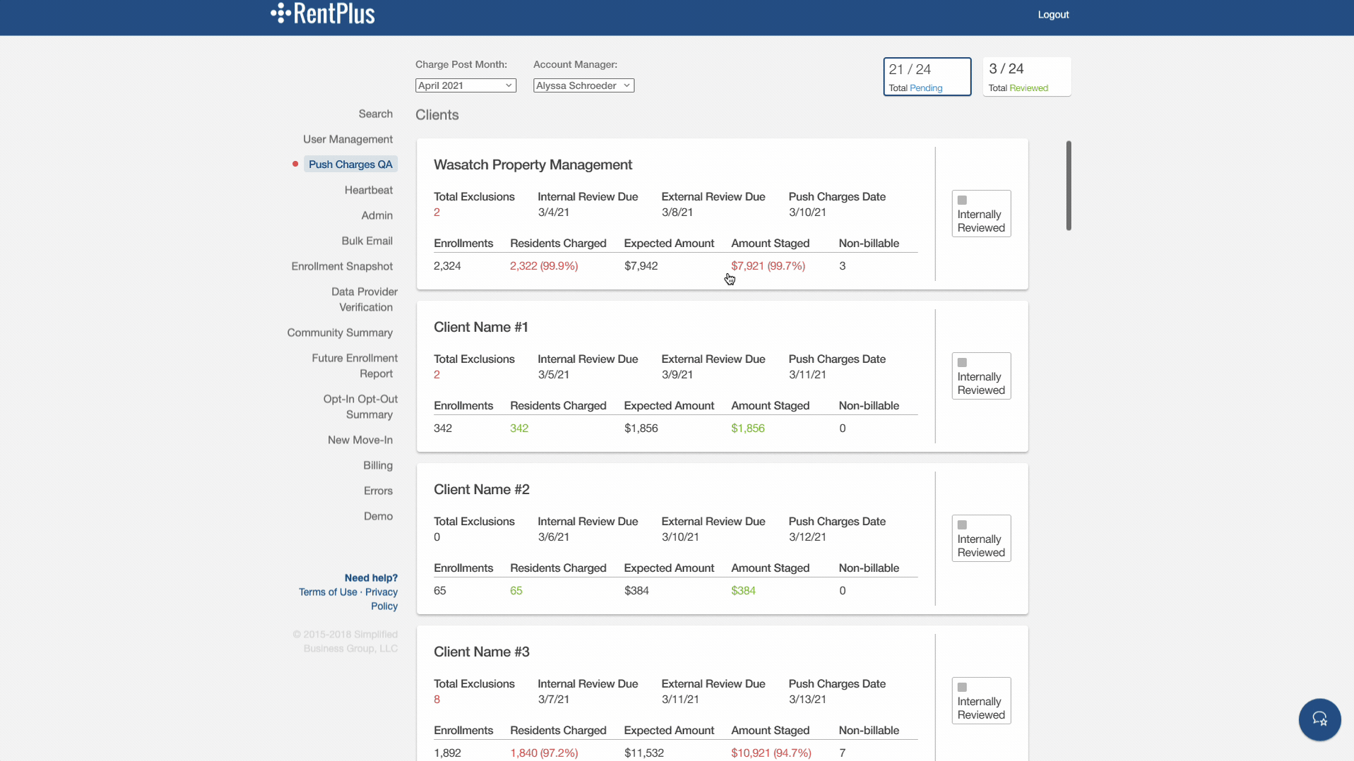
I learned quickly during interviews that our users did not utilize the client level stats. There was uncertainty around the accuracy. Also, these same stats were provided at the lower community level if they wanted to reference. The amount of clicks were reduced by replacing the client level page with a filter.
It was also necessary to include multiple actions on the front-end that our team of engineers were constantly having to do on the back-end, taking too much time from other projects.
Early Iteration
Below is an early iteration with the addition of the filters. There was also a desire to include charge splits for reference, which could only be viewed in a completely separate admin tool after many clicks. Including it on this page would cut down on cross referencing time. In this early iteration, I wanted to get all the components on the screen, but there was way too much shoehorning going on.
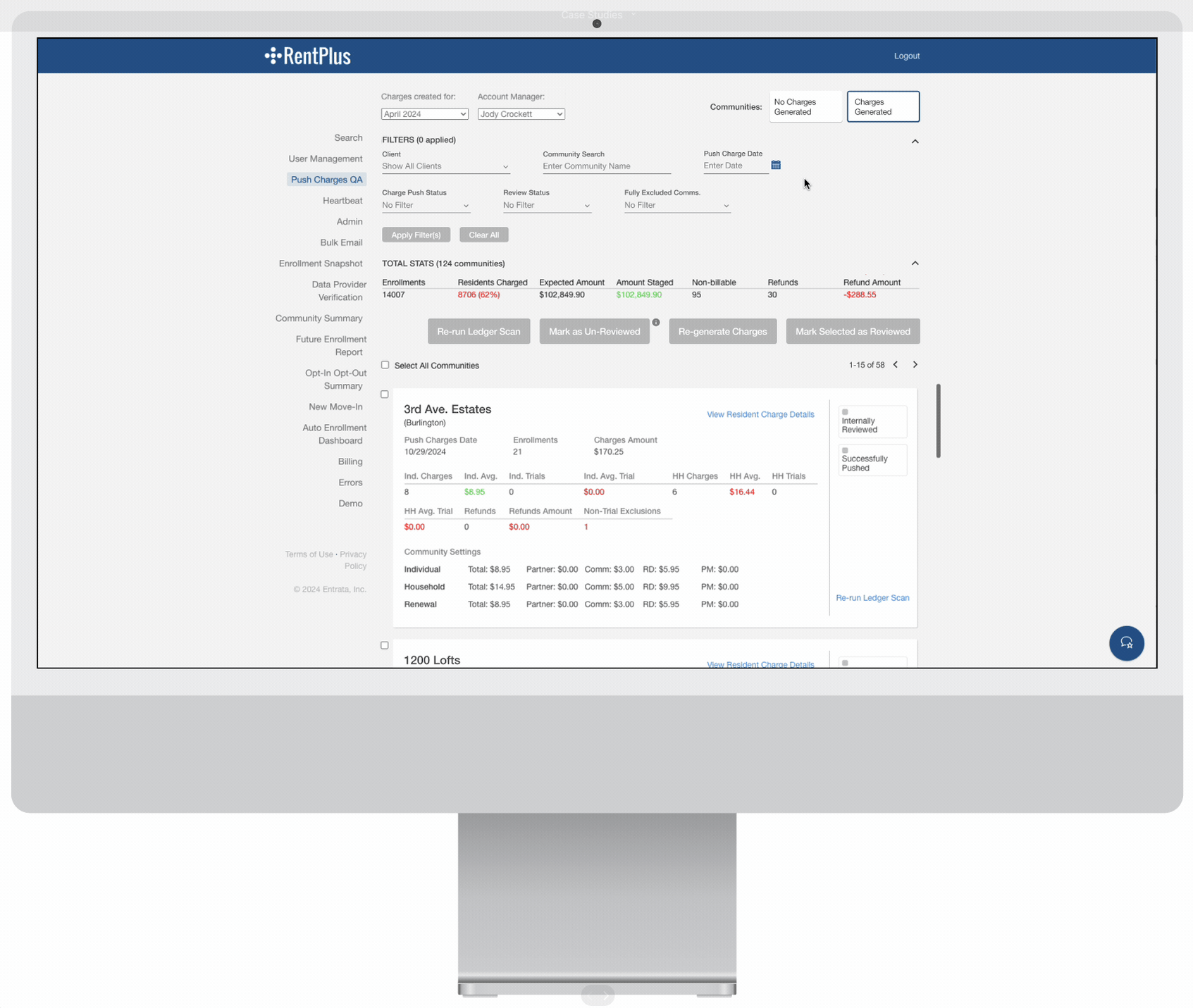
At the top of the screen, I decided to remove the top level client page all together since the stats the client card displayed are already included on the community level page for the selected client. The top level page was replaced by a dropdown filter near the charge creation month and account manager filters. The tab stat components at the top right of the page would quickly show how many communities needed to be reviewed and I was determining what it would look like to add an additional tab for the “No Charge Generated” communities. As you can see, it looks very crowded and small resolution screens would make for aesthetically unpleasing object wrapping.
Filtering and Tabs
Early mockups included shoehorning a new tab, which only added to the busy-ness at the top of screen. I received feedback from our account manager users that they didn’t really need to have all of the clients and communities broken up. They just wanted to be able to perform the QA process for all clients as quickly as possible.
Another insight was users would sometimes be confused if they were at the Client vs. Community (property) level. It would take seconds to re-calibrate themselves, which was not ideal. This led me to explore concepts where all communities assigned to a specific account manager would all appear in the same list. The account manager can then filter by client if they would like.
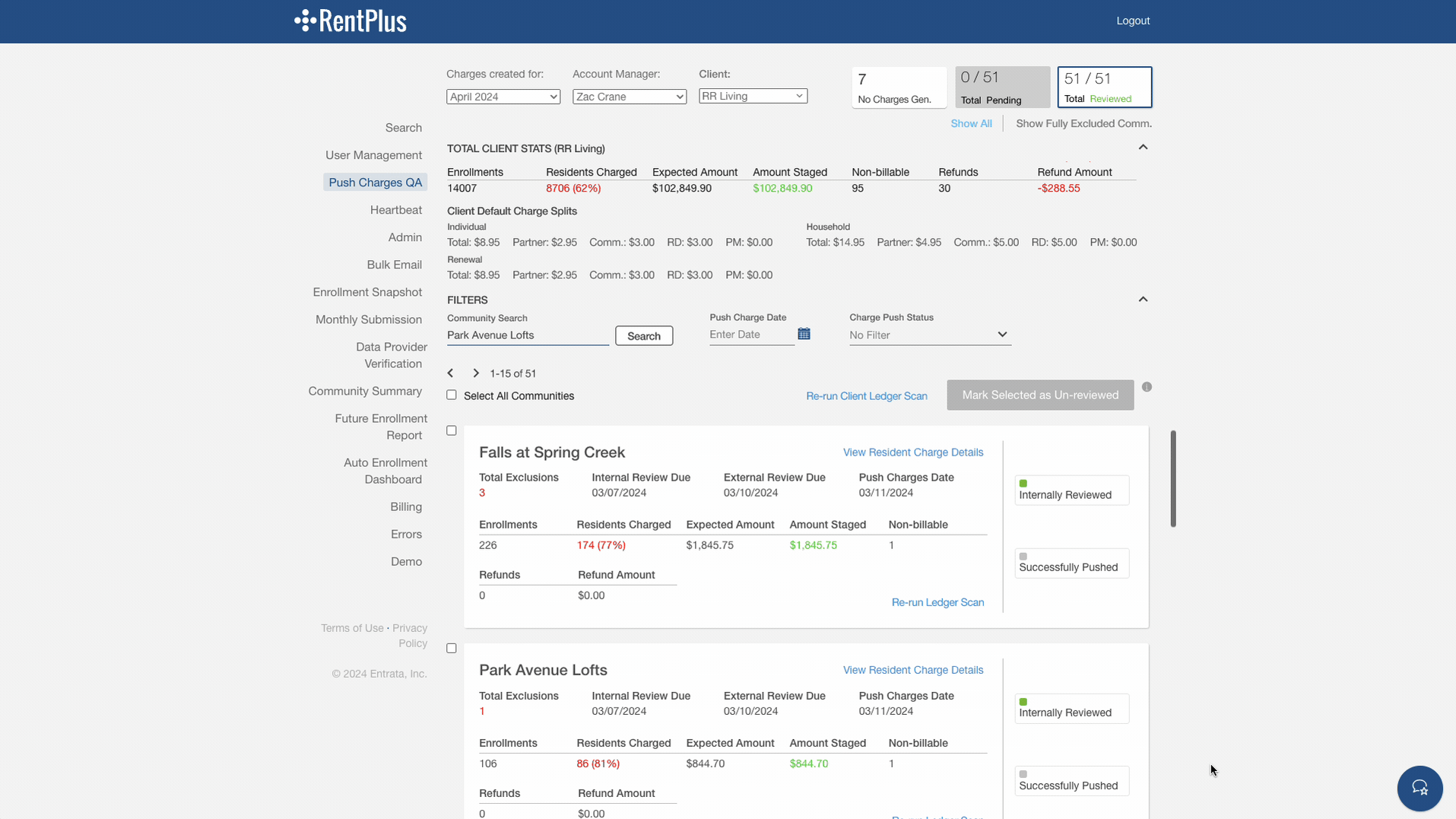
Pagination and Performance
Previously, the list of clients and communities had an infinite scroll and users experienced long load times. To improve, we implemented pagination, limiting the display of community cards to 15 per page. Our engineering team was also able to improve the load times.
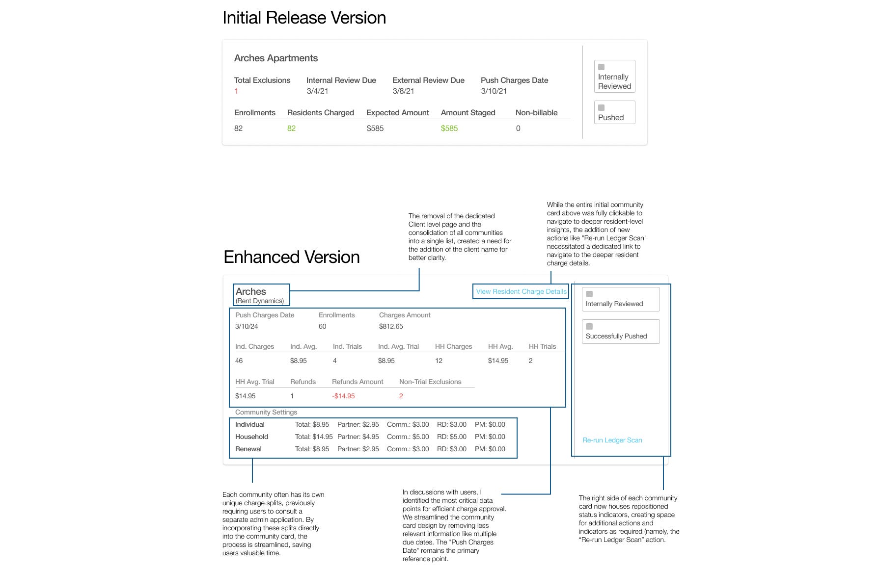
Updated Data Points
Based on the initial research and discussions with users, we discovered that there were other data points that would be more helpful to have surface on the Community charge summary cards. These new data points would allow users to more confidently QA and approve charges at a glance, saving them time on this important task.
Card Update Comparison:
High-Fidelity Prototyping:
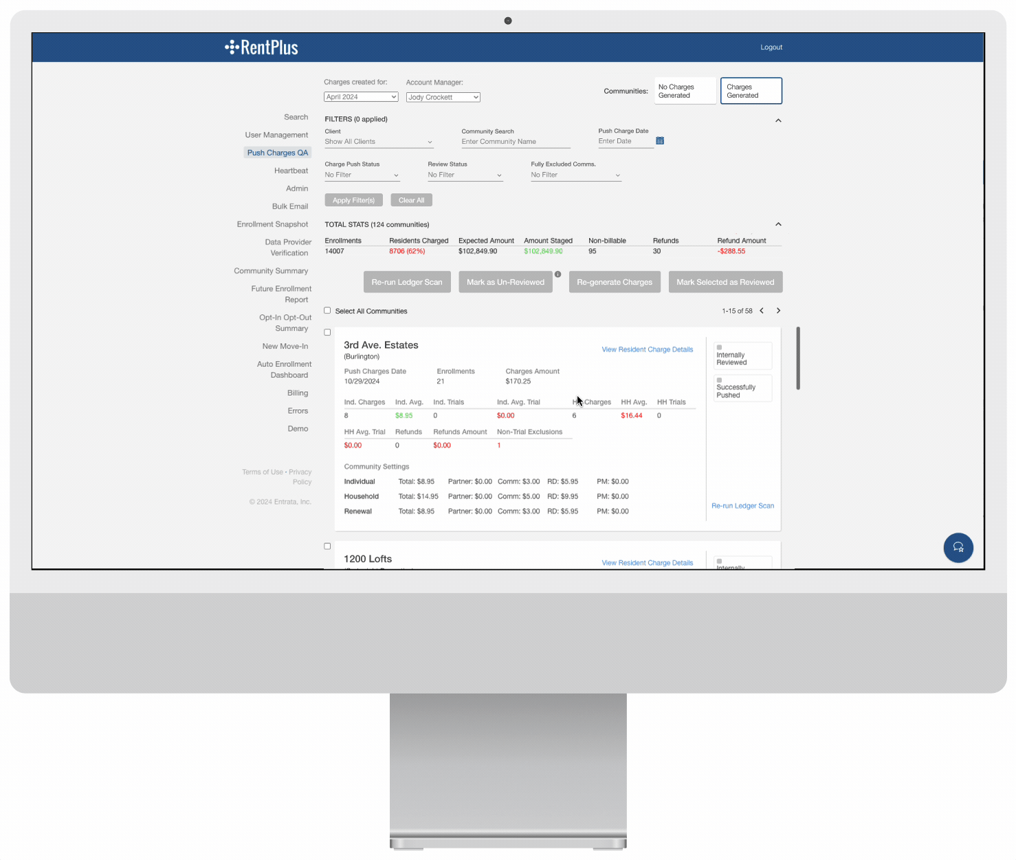
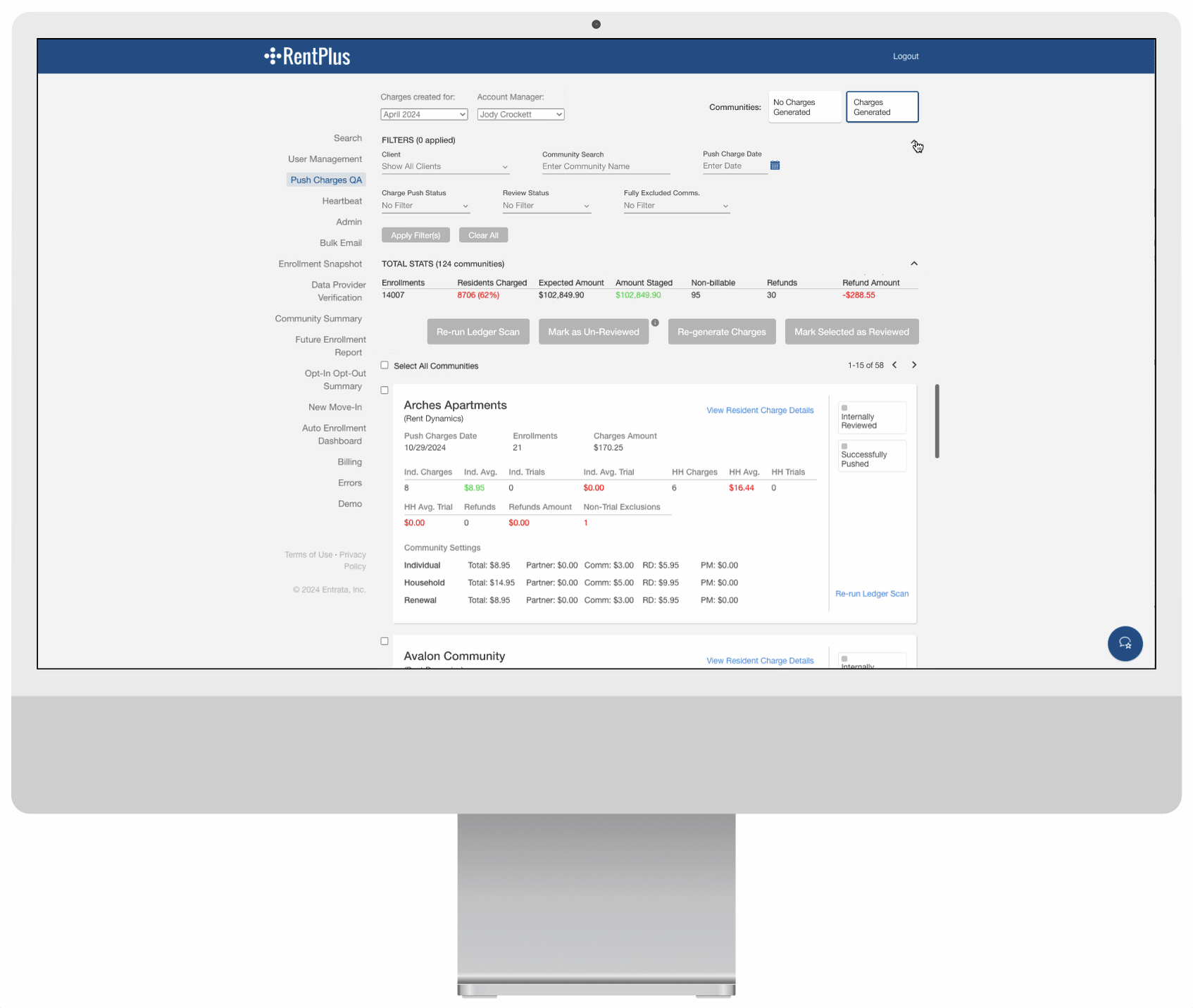
To declutter the screen and focus on relevant data, I’ve added the option to collapse and expand both filters and total stats. Given that communities can belong to different clients, displaying overall stats before filtering isn’t the most helpful until a user has filtered down to a specific client.
Sometimes, data sync issues with our clients’ property management systems prevent charges from being generated on the RentPlus end. Previously, these communities without charges cluttered the main community list. Users had to manually sift through and mark them as reviewed. Our new design streamlines this process with a dedicated tab for uncharged communities. This tab provides a clear, concise list, highlighting community name, client, and resident enrollments. Users can now quickly select and retry charge generation for multiple communities at once.
Results
The revamped Push Charges QA workflow was successfully deployed a few months ago. Account Managers reported an average time savings of approximately 1.5 hours per week due to the new filtering capabilities. Time savings varied based on different number of clients assigned to managers. The product team has continued to receive positive feedback from users with emphasis put on faster loading times and less clicking to see what they need.
Lessons Learned
A key takeaway from this project was the importance of rapid iteration. By quickly testing and refining my designs, we were able to deliver a solution that significantly improved efficiency for our internal team and provided a much cleaner and intuitive experience.
